
RiFee
Brand
A set of 3 adhesive labels for products from within a common range.
* Made-up brand created for this project

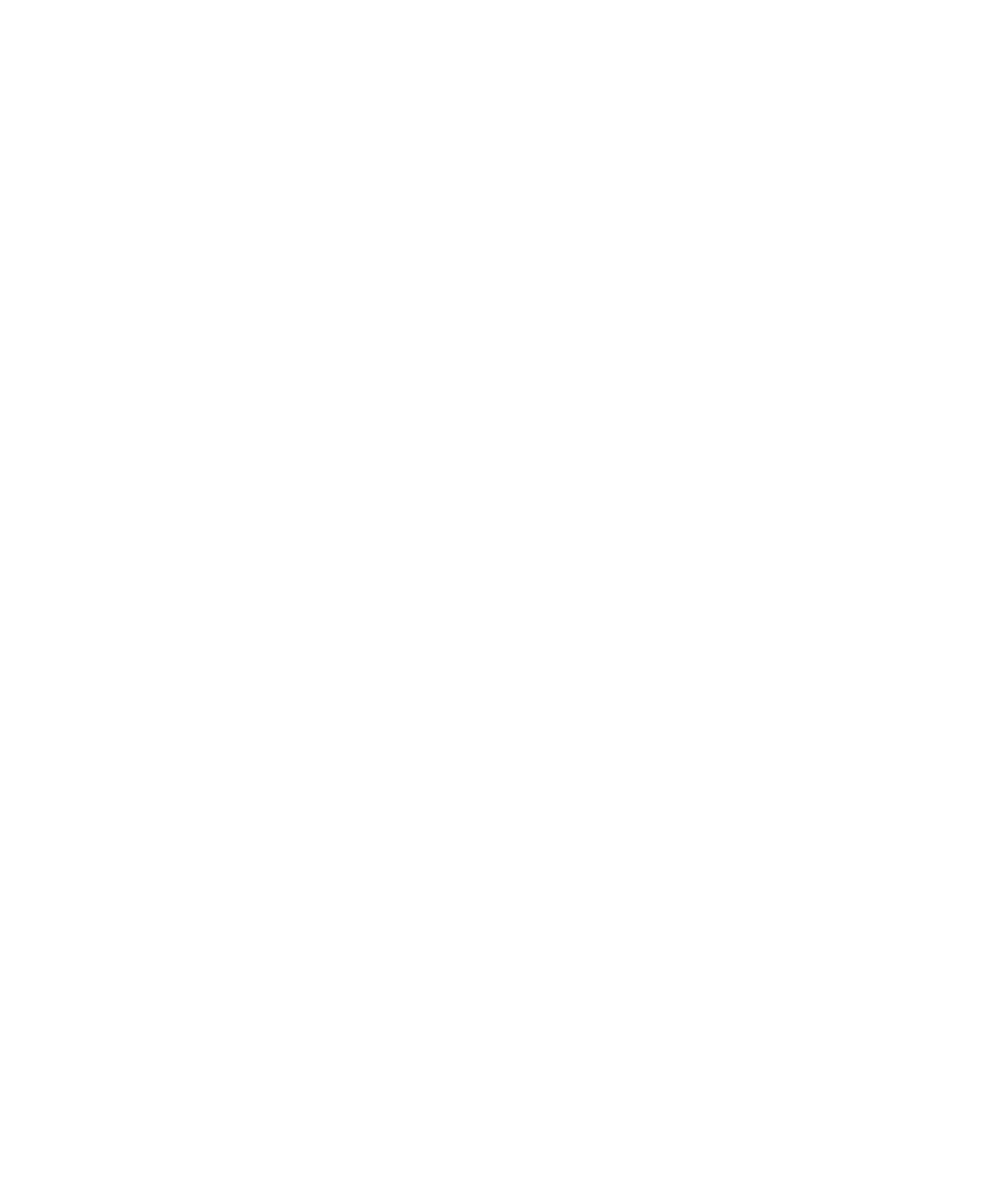
“RiFee” stems from “revive, revivify”; it also sounds cute, influencing the “kawaii” style of the mascots. The brand intends to portray itself as youthful, outgoing, fun, fashionable, lovely etc.
Custom font derived from “Bello Script” by Underware.
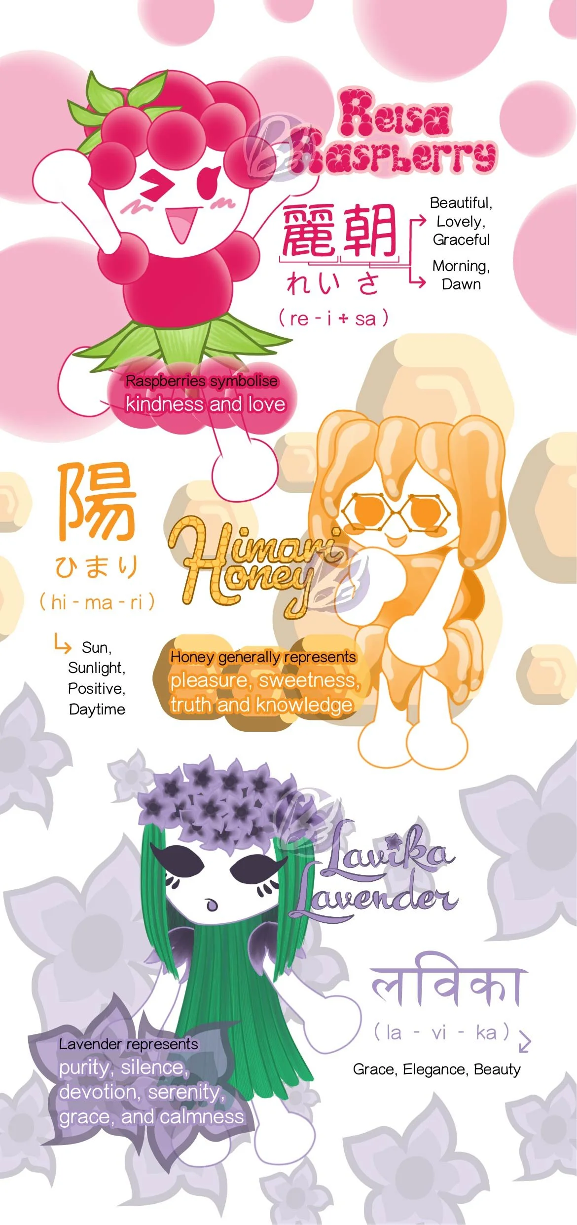
Reisa Raspberry
Custom font derived from “Synthemesc” by Ray Larabie (Typodermic.)
Reisa has a fun/energised/outgoing demeanour, composed of berries & circles, and is mainly coloured as hot pink (with pop green accents).
She has a circular head, is warm-coloured (like Himari), and raspberries are a symbol of beauty (like lavender).
Himari Honey
Custom font derived from “Pacifico” by Vernon Adams (Google.)
Himari has a shy/droopy/clumsy demeanour, composed of drops & hexagons, and is mainly coloured as amber (with brown accents).
She has a ovular head, is warm coloured, is introverted (like Lavika).
Lavika Lavender
Custom font derived from “Kewl Script” by Alejandro Paul (Sudtipos.)
Lavika has a calm/cool/elegant demeanour, composed of petals & reeds, and is mainly coloured as lavender (with evergreen accents). She has a triangular head, is a symbol of beauty (like raspberries), is introverted.
* Unlike Reisa & Himari, Lavika does not have a Japanese name as “L” does not exist in the Japanese language, although in the script used for non-Japanese words (Katakana), her name could be written as ラヴィカ.
Although the brief behind this project also focused on formatting adhesive labels according to technical printing standards, in terms of the (theoretical) branding behind RiFee, it ideally would not be limited to shower gel. Depending on the limitations of flavouring, these characters (and potentially more) could be represented via other products, related to other consumable products. Furthermore, the whole cast would not be limited to non-consumable products that would also be appealing to the youthful demographic, like decorative collectables (plushies, figurines, keychains, stickers, badges, device cases etc.).
The demographic that I aimed to design for influenced the overall design approach of these labels. Considering my interest in character design,
I took this as an opportunity to create mascots, drawing great inspiration from other female-targeted, character-based brands like Sanrio,
Sailor Moon, Disney and Pokemon — The fun concept has always been popular with the youth, and has especially been trending in the contemporary era.
Consumable products are usually more enjoyable when themed with particular flavours and designs appealing to the demographic.
Each of the characters that I designed represent different flavours, to which each of them possess symbolism that further influenced their personality and physical traits — presenting a range of relatable & likeable characters, I intended for them to be appealing to different members of the target audience.